TONYMOLY Redesign
TONYMOLY is a Korean cosmetic brand of lip balm packaging that was redesigned to become more eye catching, appealing and more bold to attract more customers. TONYMOLY is a colorful, kawaii like brand that has a touch of playfulness to it. Customers can purchase TONYMOLY products at Ulta or online.
Mood Boards
The Design Process
Sketches
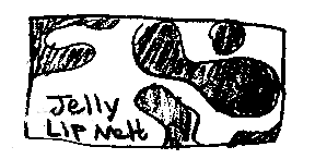
For these sketches I tried to focus mainly on typography and abstract shapes. I was trying to find a way to fill the space with something that creates that “jelly” like look. I wanted to have a lot of curved flowey shapes, lines and letters.
Layout Drafts
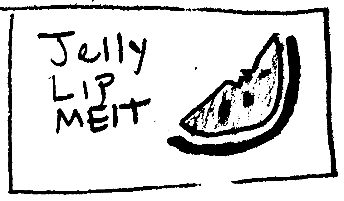
I created several layouts to show the flavor profile, the abstract jelly shape aesthetic, the characters, the bold, eye catching colors.
Second Drafts
This moodboard was inspired by cute product characters. I found inspiration in kawaii faces and having different characters for different flavors. I was looking for something to help show another form of expression and to make the brand stand out more.
For this moodboard I wanted to create a jelly like asthetic. I found inspiration in wavy letters that created movement and curvy abstract line that gave it this flowey/slime like vibe to it.
I wanted to incorporate the flavor in this sketch and also show some type of character. I wasn’t sure weather to show just the watermelon or a jelly. So I played with several ideas based off inspiration from the moodboard.
I made sure to showcase that the brand also had another flavor “blackberry”. For this I used the same layout but only played with the colors more.
The Original Package Design
Finals Designs
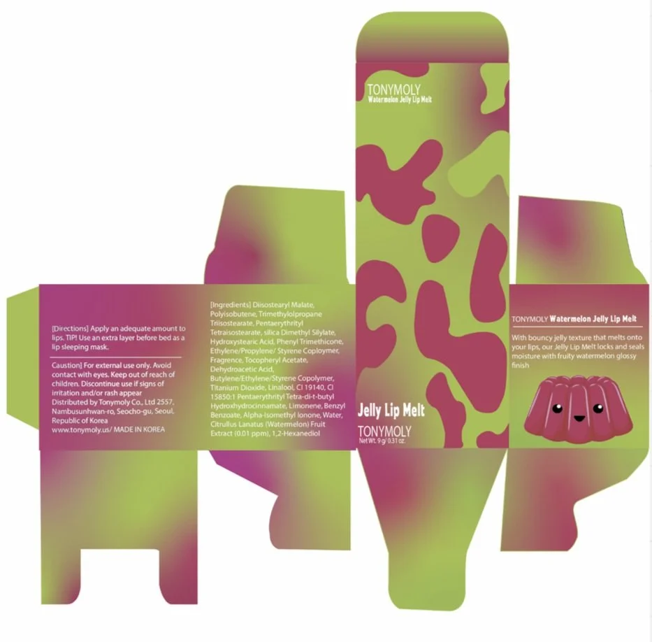
For the final designs I smoothed out the shapes, added more personality to the jelly characters, brightened the colors, adjusted the type layout to be more fitting and placed designs of fruit to show the lip balms flavor.
The Challenge
The challenge was to recreate two package designs to make it more bold, eye-catching, unique and fun with the ability stand out against other brands.
The Solution
To overcome this challenge I created a bright colorful package layout design. This design includes a characters, abstract flowy shapes and colorful gradients to attract customers and to become a memorable, unique design.
Reflection
Through this process I learned that I really love creating package designs. I enjoyed studying package layouts and creating my own in Illustrator. What was the most fun was adding my own design to the layout and playing around with color. It was so satisfying to watch the mockups come together!


