Dancing Kitsune Sake
Dancing Kitsune Sake is a high-end bottled alcoholic beverage that can be sold at Whole Foods, Central Market and Trader Joes. Dancing Kitsune Sake is authentic premium Junmai Daiginjo from Japan. This drink is perfect for those who wish to spend money on premium authenticity and has appreciation for the finer things.
Mood Boards
The Design Process
Sketches
For these sketches I tried to focus on different foxes and dragons to design my logo with. I experimented with different lettering layouts, flames and even Oni masks.
Layout Drafts
Draft 1
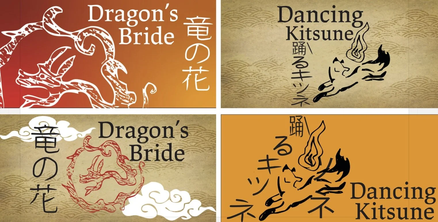
I created several layouts to decide what direction I wanted to go with and what I wanted to name the Sake brand. I was debating on going with “Dragons Bride” and played with a couple dragon sketches as the logo.
This moodboard was inspired by traditional Japanese art and calligraphy. I wanted to capture the aesthetic of the art style. The logo design was inspired by the Kitsunes which are the foxes associated with fire shown below. They are popular in Japanese Mythology
I wanted to create a moodboard that had shine and golden aspects to it. I wanted this brand to represent luxury in a way and to attract people with an appreciation for the finer things so I gathered as much inspiration I could with golden foil and aspects.
I was focusing on drawing inked letters, different types of flames and lettering and a fox mask. I was gathering as much inspiration as I could from the moodboards.
Draft 2
I decided to narrow down on “Dancing Kitsune” as the sake brand name and the flame fox logo. From here I decided to expand on this and create a “Sparkling” Sake for the brand so the customer can have more of a variety.
Draft 2
Bottle Drafts
Draft 1
For the first draft I used the incorrect bottles and made the label to large. I was also using incorrect Japanese spelling.
This draft came out better because I corrected the spelling, found the right bottles, darkened the orange so it could pop more and created a golden cap.
Final Designs
For the final results I took away the orange and black background for the label and decided to make it transparent. The Japanese sake bottle label now has a slight tint of gold in the background instead of only orange. I also went in and used real ink and a brush to get the letters instead of using online tools.
The Challenge
To design a high-end beverage bottle that would attract a group of people who would not mind spending money just because of the design on the bottle.
The Solution
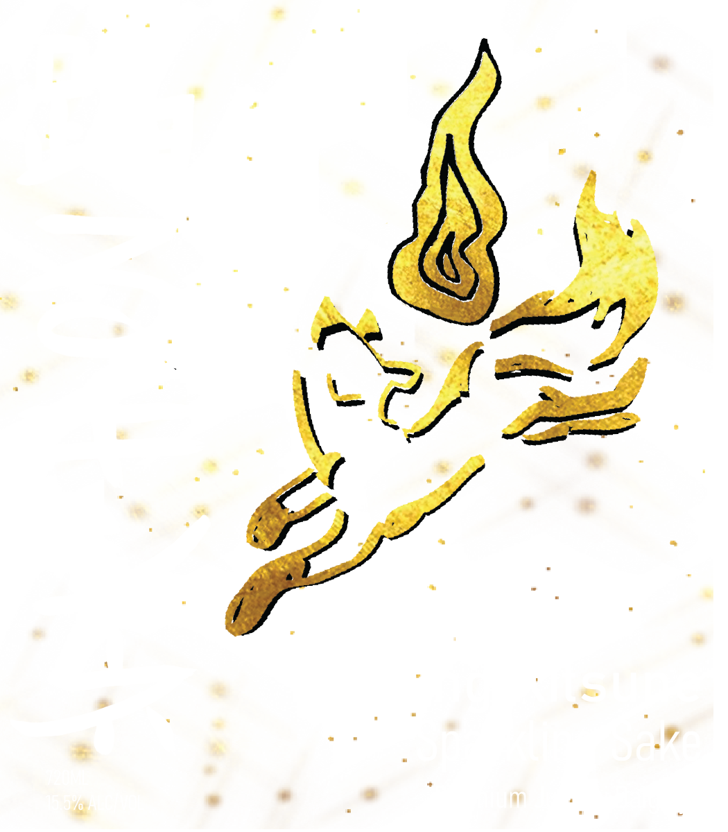
To solve this challenge I created a bottle that will capture the attention of customers from far away. The bold ink letters attracts attention as well as the golden fox with a flame design which is iconic and stands out amongst competition.


Reflection
This was one of my favorite projects by far! I loved seeing this come together. Watching the sketches turn into an actual product is so satisfying. I enjoyed adding mixed media to this design and actually using ink and a brush to capture the design of the letters.


