Pecan Street Festival
The Pecan Street Festival is one of the largest, and longest-running, arts/crafts and music festivals in the nation. This festival takes place bi-annually in the spring and summer and is held in downtown Austin Texas.
The Design Process
Mood Boards
Typography
As always I wanted something bold and to stand out. I went on an adventure to find some interesting typography to inspire my poster design. Even though this doesn’t look like the poster it still gave me some ideas and allowed me to explore my options.
Sketches
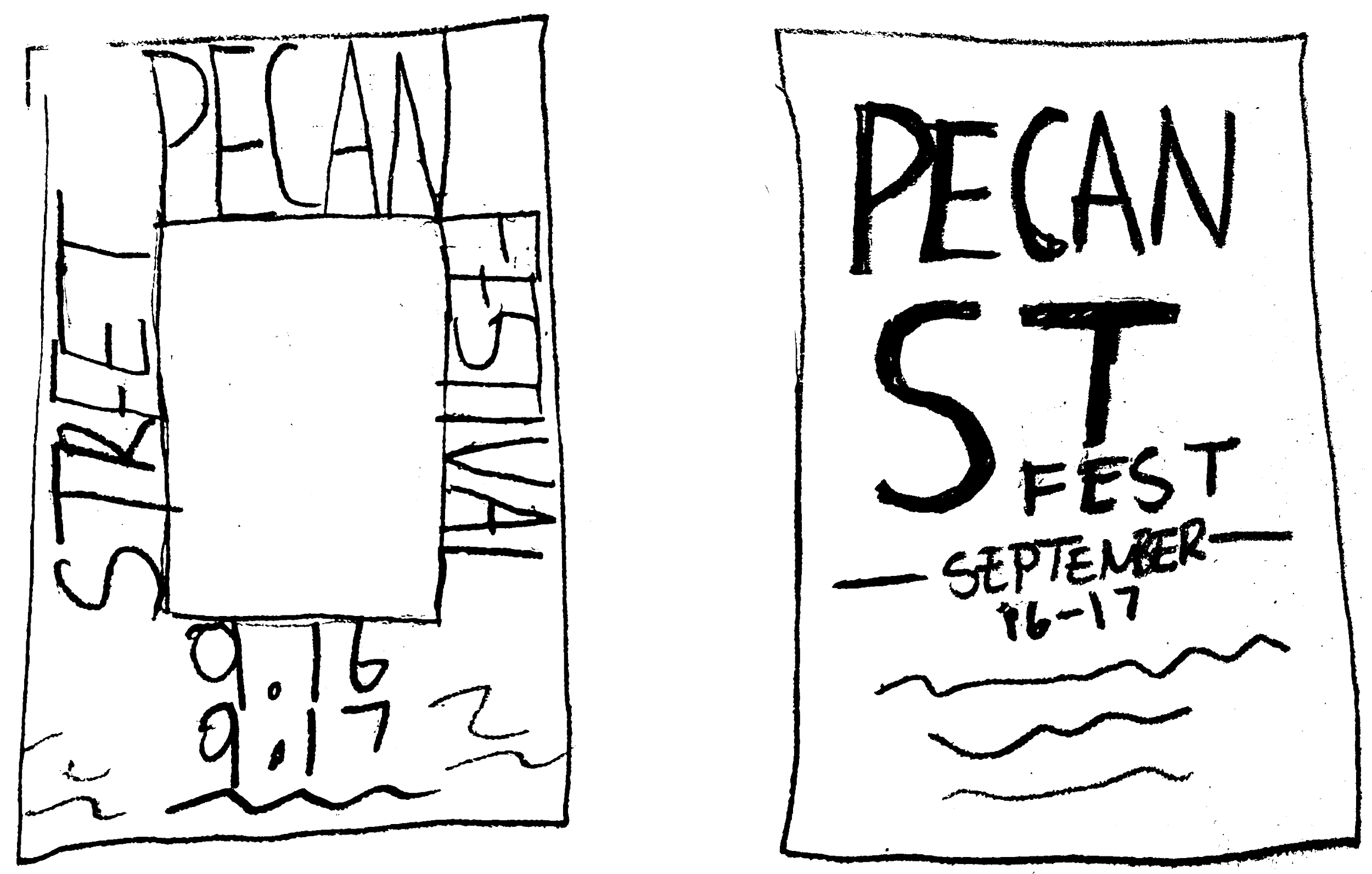
For the sketches I wanted to play with the idea of how the text should layout on the poster. I used the first mood board as inspiration.
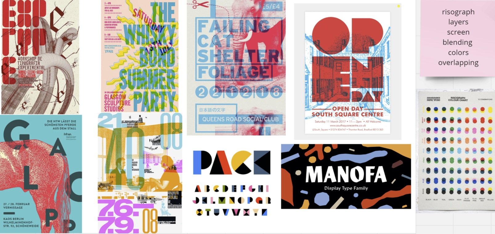
This mood board was a lot of fun because through gathering inspiration I learned what a risograph is. It is where you have a see through color overlapping another color. I enjoy how unique and creative this mood board is.
For this mood board I really enjoyed the layout of the text and how it is laid out in an unconventional way. I also found inspiration in simple typography.
I was exploring artistic and abstract type styles to help me understand what I wanted in my poster design. I realized I wanted something where the letters merged together.
I narrowed down to the top two sketches that I thought would be a great poster layout. With more refinement I decided to go with the second poster sketch.
Poster Drafts
For my first design I wanted to show the city of Austin Texas, I included the dates and times of the festival. I also attempted to make a unique type layout.
Draft 1
Draft 1
For the second draft I worked more on the opacity of the colors and the blending options. I also went ahead and made the informative text smaller.
Draft 2
Draft 4
On draft three I decided to make the colors brighter and to make the informative text white and brighter so it can be easier to read. I adjusted the T to fit more with the typography style.
Draft 3
I made the colors even more brighter than before. I simplified the dates and times. I also added the location of the event and a small description of what the event is.
Final Designs
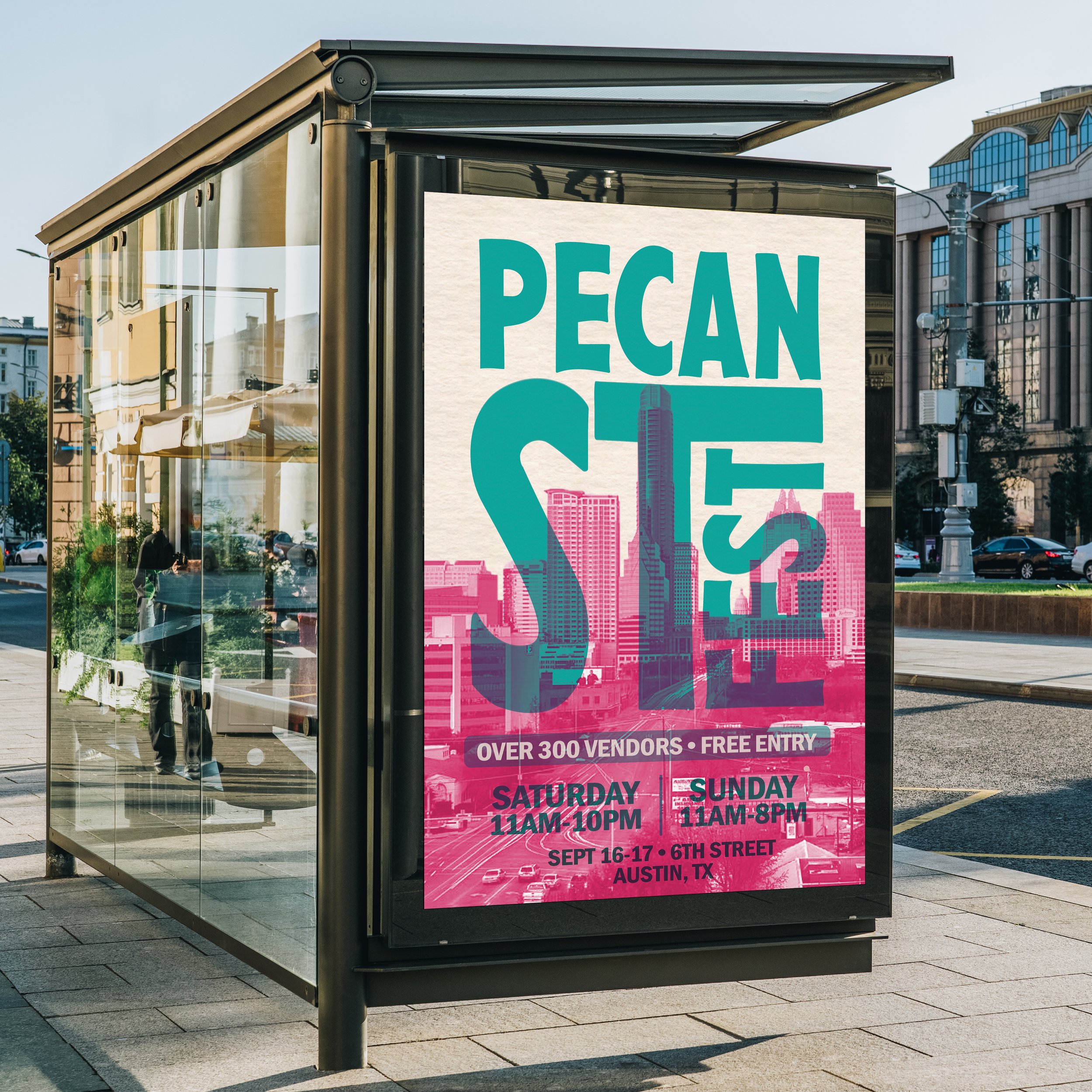
For the final design I increased the size of the location text and darkened it more so it can be easier to read. I also expanded on this project by making posters and banner mockups as well as creating merch such as a T-Shirt and tote bag. I decided to go with different colors for the merch because I didn’t want to keep using the same colors over and over and having every design look the same. I also feel like the colors on the merch are more eye-catching.
The Challenge
To design a poster for an event and to expand on the concept and how to make the poster and designs stand out and attract people to come to the event.
The Solution
This challenge was solved by using bright colors, unique typography and bold lettering to help capture the attention of the viewer. The mockups help show the many ways this festival/event can be promoted to help spread the message to the audience.


Reflection
This project was super cool because it gave me the chance to learn new skills in Illustrator such as knowing how to blend objects to give it that see- though, risograph feel. Over all, I enjoy the way this turned out! I look forward to designing for another event!


