Veggi Patch Website
The Veggi Patch website is designed for people who want to explore a plant-based diet or for people who are vegan. This website makes it easy to find plant-based recipes without the hassle of worrying if the ingredients are vegan. The website also displays information on what Vegan is and seasonal recipes.
The Design Process
Mood Boards
Sketches
These sketches display my ideas on how I wanted each section of the website to look when scrolling. You can see how I used these sketches to further develop the website. Basically this sketch shows an idea for the home screen and different meal occasion layouts.
Mid-Fidelity Wireframe Sketches
I created several layouts on what design I wanted for the home screen. I explored the idea of using circular images to display the category, different type layouts and using different phrases.
For this I gathered inspiration based off of a previous project where I designed a business card. The neutral background, the bright oranges and green, the aesthetic over all. Also, the dark, thick typography was another source of inspiration.
This mood board features bright colors and neutral greens. I wanted inspiration for Veggi Patch to have earthy colors and greens. Kind of like a vegetable garden color scheme. I also took inspiration in the bold typography.
For this section I wanted to focus on what it would look like if you clicked to another page. I explored ideas that featured a dessert section, ingredient substitutes, a recipe page for cheesecake and other layout options.
I wanted to explore a website display that shows more square images, some stacked and some taking over the screen horizontally. These ideas helped me decide what direction I wanted to go when designing this site.
Wireframe Drafts
This was my fist design for the home screen. I designed the home section which featured bright colors, links and a search bar. I also created the section that displayed the meal categories. Over all this was only a start.
This design displays what happens when the user clicks on a meal category and then navigates to a recipe. This shows a photo of the recipe, the ingredients and directions along with links and a search option.
2nd Draft
For the second draft I touched up on the home screen section by darkening the background to make the words pop more. I also made sure to add more sections to the website that features seasonal recipes and an informative vegan section.
I touched up on the typography, the photo, darkened the header, adjusted the footer and made some small tweaks on the body copy.
Final Designs
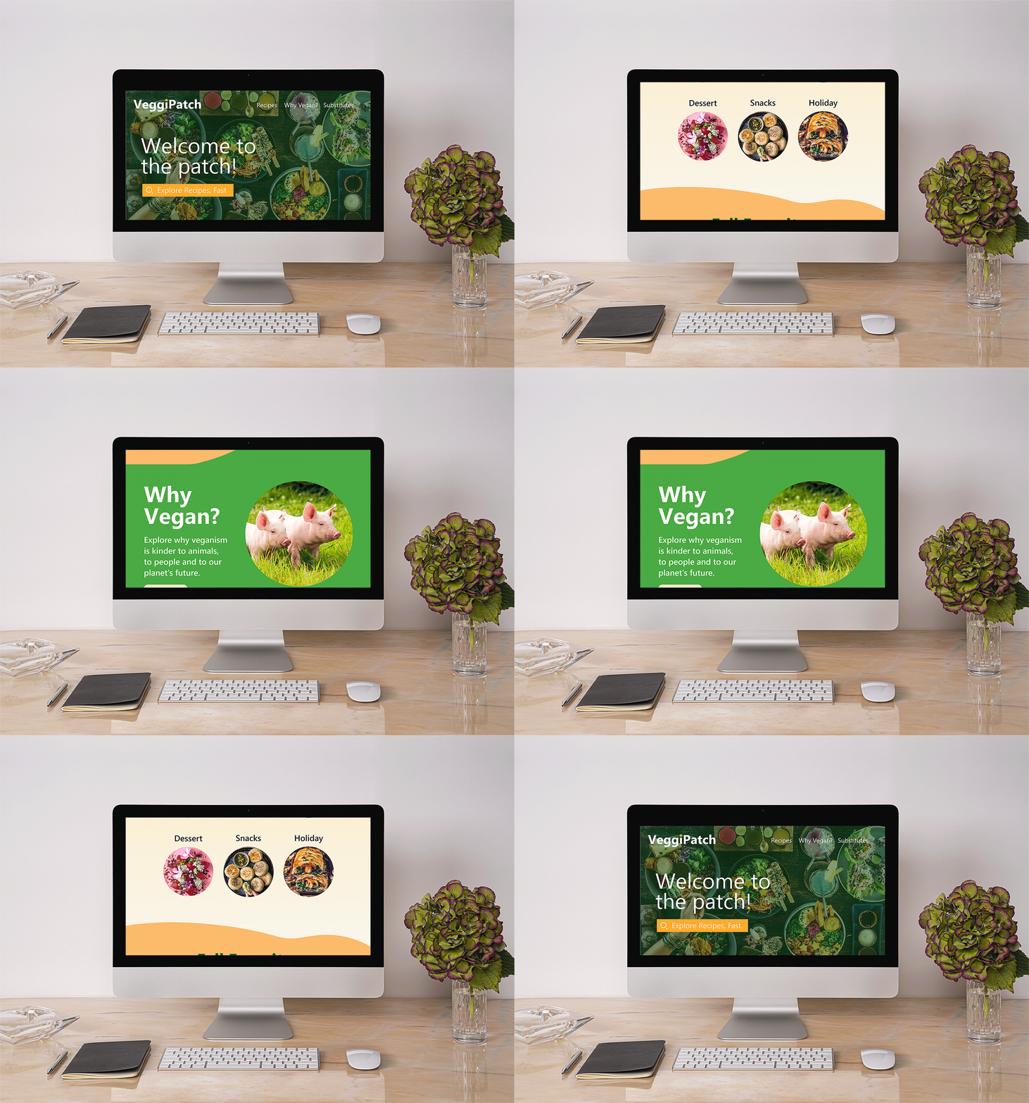
For the final touches I brightened the colors and made the type more bold. I brought the meal categories closer together and added abstract wavy shapes to divide the sections. For the recipe website layout I made the text smaller so it can fit on the screen better.
Final Web Layout
Website
Tablet
Phone
Website
Tablet
The Challenge
The challenge was creating a recipe website for people who were plant-based that features a home page and recipe page while also being accessible on a computer, tablet and phone.
The Solution
This challenge was solved by creating the wireframes to see how the site was going to be built, then deciding how the colors, images and texts will come together. After many drafts and trial and error the solution was found and the website was made.
Final Mockups
Reflection
This project made me fall in love with web design. I enjoyed bringing photos, text and colors together. After this project I became confident in my ability to design UI and web layouts.


