Seoul Multi-Channel Campaign
Seoul Multi-channel campaign features a website, brochures and merch to help promote and assist anyone who wants to visit Seoul, South Korea. The website and brochure provides information to people who are new to Seoul or want to learn more about it.
The Design Process
Mood Boards
Sketches
Logo Sketches
I wanted Seoul to be very bold, yet simple, maybe kind of cute but definitely one of a kind. I explored adding faces to letters to give personality. I tried different letter shapes, adding lines and even playing with the thickness of lines.
Brochure Sketches
Logo Drafts
Draft 1
I decided to go with the sun “o” design and began to simplify it. I removed the words underneath the logo and took away some of the lines around the O to give off that effortless look.
I wanted to explore the concept of a mind map. What exactly did I know and think about Seoul? Through this process this brought me many ideas and gave me several concepts about how I wanted to go about my designs.
I wanted this moodboard to symbolize the colors of nightlife signs and lights since Seoul is known for their active night life and technology. I was thinking maybe dark and pastel colors?
I went digital and narrowed down my designs to three. I wanted the first one to have a smiley face so I put dots above the U. The second one I wanted the O to look like it was lighting up. The final one I added a curved like under the e and o and made it into another smiley face.
For the second draft I decided I wanted to add some color to the logo so I chose red, dark blue, and black which are the colors of the South Korea flag. I also brought the lines about the O closer together.
Brochure Drafts
This was a pretty rough sketch but it basically helped me understand how I wanted the brochure to be laid out and where I wanted the text and photos.
These sketches acted as a guide to help me see where I wanted to place things. These sketches were for the front and back of the brochure.
Draft 3
For the final draft I only made some minor tweaks and brought the letters closer togther.
Mid-Fidelity Wireframes
For the wireframes I explored two different options on how I wanted to layout the website. For the first one I was think of simple square icons going horizontally across the screen.
In this wireframe it shows more variety such as stacked squares and circles across the screen. I wanted to explore a more complex layout.
Draft 2
Draft 1
This first draft was basically me figuring where I wanted certain sections to be, what text I wanted in that section or what photo goes where.
For the first draft I started to understand how i wanted this to look. I decided what photos to use, what font to go with and how I wanted to add color to this.
Draft 2
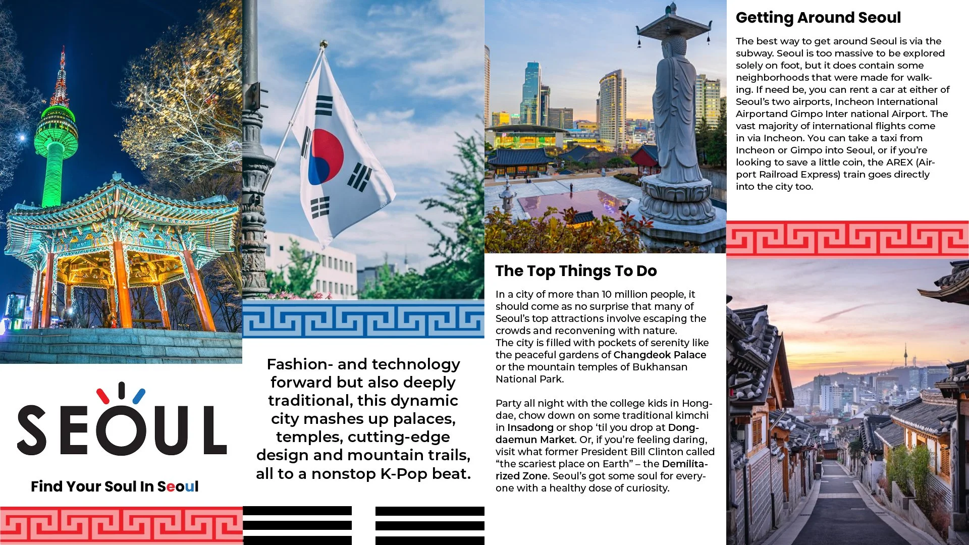
I started to narrow down on how much text I wanted to use and how I wanted to incorporate small designs as a divider. The black lines represent the lines on South Korea’s flag. The pattern across the boarders represent the pattern they have on houses and fences.
Draft 3
Website Drafts
Draft 1
This was my first draft where I added text and photos to see how it would come together. I decided to go with the second wireframe with more variety.
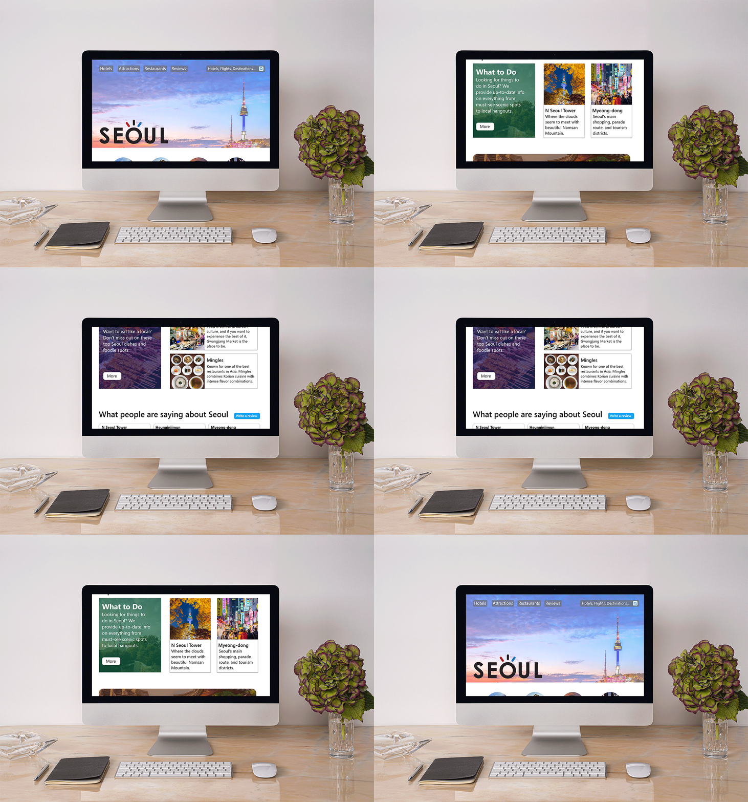
For the second draft I made minor tweaks. I adjusted the home page and where the search bar is. I also changed the layout of the third row to where it looks more interesting and doesn’t repeat. I also made the footer more bold and gave it a simpler look.
Draft 2
For this I made a few small tweaks. I fixed the boarder black line designs. I adjusted and removed some text to make it more spaced and simplified.
Draft 4
Final Designs
For the final designs I added the “Seoul” logo to the website and changed the background photo of the home screen. I also removed some more text from the brochure and simplified it even more to make it easier for the reader. I went ahead and created a tote bag with the same pattern seen on Seoul’s houses and fences and added the logo to that as well.
The Challenge
The challenge was to design a multi-channel campaign for a city to promote tourism that is consistent with branding and a logo.
The logo
The Brochure
The Website
The Merch
The Solution
This problem was solved by designing a logo and color pallet to use as branding. The brand remained consistent throughout creating brochures, a website and tote bags to attract visitors and tourists and to provide them information and a guide around the city.
Reflection
This was a very long and thoughtful process that expanded my thoughts on designs. This required me to design many things such as logos, branding, websites and brochures. It was interesting watching this process playout but over all I am satisfied with how it came out.


